Chapter 7 统计图形笔记
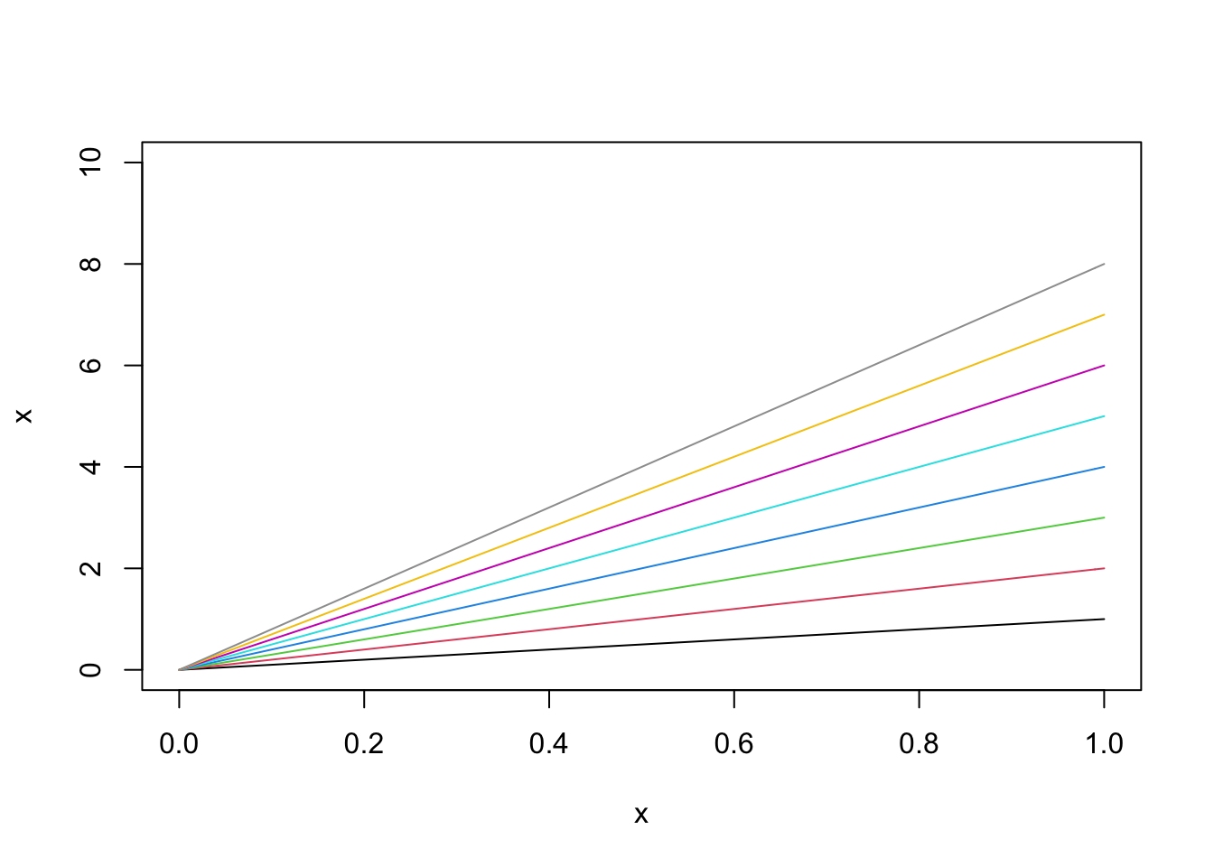
使用 palette() 进行批量获得色彩
比如说
x=seq(0,1,0.01)
plot(x,x,type='l',ylim=c(0,10))
for (i in 2:10) {
  lines(x,i*x,type = 'l',col=palette()[i])
}
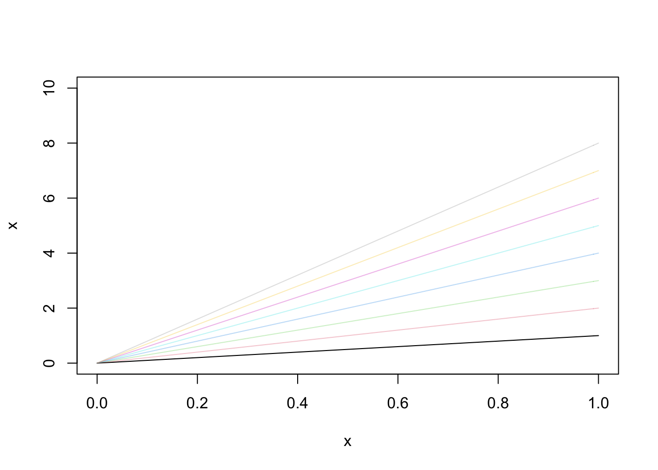
可以使用adjustcolor(palette()[i], alpha.f = 0.5) 给上述色彩增加透明度
例如:
plot(x,x,type='l',ylim=c(0,10))
for (i in 2:10) {
  lines(x,i*x,type = 'l',col=adjustcolor(palette()[i], alpha.f = 0.3))
}
7.1 图例:
legend()
第一个也可以用“topright”这种.
legend(2000,9.5, # places a legend at the appropriate place
c(“Health”,”Defense”), # puts text in the legend
lty=c(1,1), # gives the legend appropriate symbols (lines)
lwd=c(2.5,2.5),
col=c(“blue”,”red”)) # gives the legend lines the correct width and color
我的样例:
legend("topright", # places a legend at the appropriate place
       c("Bayesian estimation","Sample Covariance","jmcmfit"), # puts text in the legend
       lty=c(NA,NA,1), # gives the legend appropriate symbols (lines)
       pch=c(1,1,NA),
       lwd=c(1,1,1),
col=c("black","red","black")) pch是点的类型,具体见这个网址
暂时把图搬过来:

lwd是线的宽度 lty是线的类型,是点的话这就用了NA。
- 使用patchwork组合图形: